|
|
Silkroad Online
|
|
|
Silkroad Forums
|
|
|
Affiliates
|


|
|
View unanswered posts | View active topics
  |
Page 1 of 1
|
[ 26 posts ] |
|
| Author |
Message |
|
sandranger
|
Post subject: Slowly but surely...  Posted: Posted: Sun Jun 11, 2006 10:57 pm |
|
| Casual Member |
 |
 |
Joined: Jun 2006
Posts: 88
Location:

|
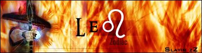
So, I continue to teach myself photoshop. I'm working brushes right now. So here's the latest creation.
Please be kind with your opinions.

_________________

|
|
| Top |
|
 |
|
sandranger
|
Post subject: Posted: Mon Jun 12, 2006 6:59 am |
|
| Casual Member |
|
|
Joined: Jun 2006
Posts: 88
Location:
|
|
hmm...I was worried about that. I'm at work right now, yes it's 2 a.m. I'll see if I can fix it when I get home.
_________________
|
|
| Top |
|
|
|
XMoshe
|
Post subject: Posted: Mon Jun 12, 2006 11:51 am |
|
| Ex-Staff |
 |
|
Joined: Apr 2006
Posts: 17293
Location: Ghosting around
|
|
It looks very nice but idd the letters are unreadeble
_________________
 Props to chrisorg for the sig <3 Props to chrisorg for the sig <3
|
|
| Top |
|
|
|
//:Protocol
|
Post subject: Posted: Mon Jun 12, 2006 3:09 pm |
|
| Active Member |
 |
|
Joined: Apr 2006
Posts: 702
Location:

|
|
Looks like a distort > Wave, with some text, with a bunch of default effects piled on, with a render thrown on top, and black bars at the top and the bottom.
You need to learn render blending, and less "Stock" photoshop effects.
_________________
Click This for a Free DS. No strings attatched. Sort of..

|
|
| Top |
|
|
|
XMoshe
|
Post subject: Posted: Mon Jun 12, 2006 4:36 pm |
|
| Ex-Staff |
|
|
Joined: Apr 2006
Posts: 17293
Location: Ghosting around
|
//:Protocol wrote: You need to learn render blending, and less "Stock" photoshop effects. sandranger wrote: I continue to teach myself photoshop. I'm working brushes right now. this and Please be kind with your opinions.
you could idd be nicer, he said he was learning the way of photoshop-_-
_________________
Props to chrisorg for the sig <3
|
|
| Top |
|
|
|
RuYi
|
Post subject: Posted: Mon Jun 12, 2006 4:42 pm |
|
| Ex-Staff |
 |
|
Joined: Apr 2006
Posts: 7145
Location: Done.
|
The Thief is nicely cut out of the original screen, no messy pixels.
I like the background aswell.  The text isn't very visible, but you already were going to fix it.
Keep up the good work! 
_________________
|
|
| Top |
|
|
|
dom
|
Post subject: Posted: Mon Jun 12, 2006 7:55 pm |
|
Joined: Mar 2006
Posts: 9966
Location: västkustskt
|
|
I'll be honest. I think the background is hideous, but:
the potential of this sig MAKES ME WET, I love the thief placement/colour selection and most of all, the two black bars.
They remind me of a header and footer from photography prints.
Just work the background a bit and it will be great.
_________________

|
|
| Top |
|
|
|
Shimohime
|
Post subject: Posted: Mon Jun 12, 2006 8:37 pm |
|
| Active Member |
 |
|
Joined: Feb 2006
Posts: 788
Location:
|
First, I think there's a little too much blank space, probably because of the background.
Also goin with the photography idea, u can either do the black bars as a film strip or try a photo border.
I think this sig has a lot of potential 2
_________________
Lvl 5x- Ice Archer
Read my avatar tutorial here
|
|
| Top |
|
|
|
N00ber_B00ber
|
Post subject: Posted: Mon Jun 12, 2006 9:22 pm |
|
| Casual Member |
 |
|
Joined: Apr 2006
Posts: 58
Location:

|
XMoshe wrote: //:Protocol wrote: You need to learn render blending, and less "Stock" photoshop effects. sandranger wrote: I continue to teach myself photoshop. I'm working brushes right now. this and Please be kind with your opinions. you could idd be nicer, he said he was learning the way of photoshop-_- sounds harsh, but being nice doesnt help, especially when ur learning. nice start. try experimenting with diff backgrounds and brushes, then u can move on creatin ur own brushes. also try using the photoshop filters the least, they dont always give a result that is controllable and accurate to what u want. learn more bout the dodge and burn, the bars are nice i agree, make the bg diff colour or lighten it up, or make the theif stand out some how. for example make 2 strokes around the thief, a light and medium tone purple, not too dark tho. then smudge them so it looks like the thief is on fire or sumthing. creativity is the key element, ur on the right path.
_________________
|
|
| Top |
|
|
|
blu3_boi
|
Post subject: Posted: Tue Jun 13, 2006 3:46 am |
|
| Hi, I'm New Here |
|
Joined: Jun 2006
Posts: 8
|
yup it's too hard to read the words, especially the first word, your character's name? I thought the background was cool XD, but for me i don't like the placing of the thief...
good choice of color for the background Thief = purple XD
_________________
--currently making one--
|
|
| Top |
|
|
|
sandranger
|
Post subject: Posted: Tue Jun 13, 2006 7:14 am |
|
| Casual Member |
|
|
Joined: Jun 2006
Posts: 88
Location:
|
//:Protocol wrote: Looks like a distort > Wave, with some text, with a bunch of default effects piled on, with a render thrown on top, and black bars at the top and the bottom.
You need to learn render blending, and less "Stock" photoshop effects.
Actually I started with the purple as the Background, burned, dodged, smudged into a big "X" then I did "distort" "swirl". The black bars are a "widescreen movie" type effect that I've grown to like. I tried to figure out how to "blend" the thief cutout better but to no avail...I haven't gotten that far yet in all the tutorials I've been skimming lol.
Thanks, I'll have time to work on it Thursday.
_________________
|
|
| Top |
|
|
|
Bakemaster
|
Post subject: Posted: Tue Jun 13, 2006 7:29 am |
|
| Senior Member |
 |
|
Joined: Feb 2006
Posts: 4732
Location:

|
|
Don't mention tutorials when dom's around. He might jump out from the bushes and bludgeon you something good.
_________________
LOL
|
|
| Top |
|
|
|
dom
|
Post subject: Posted: Tue Jun 13, 2006 11:00 am |
|
Joined: Mar 2006
Posts: 9966
Location: västkustskt
|
|
Just practice alot, tutorials can't make you good. Using tutorials to make a "work of art", is like having a sculpter use pre fabricated modular pieces.
_________________
|
|
| Top |
|
|
|
sandranger
|
Post subject: Posted: Tue Jun 13, 2006 11:03 am |
|
| Casual Member |
|
|
Joined: Jun 2006
Posts: 88
Location:
|
|
Right, but I can only practice the "right" way if I find out what Photoshop CS2 can do and all the tools available. Believe me, in my field practice really makes perfect lol.
_________________
|
|
| Top |
|
|
|
N00ber_B00ber
|
Post subject: Posted: Tue Jun 13, 2006 7:21 pm |
|
| Casual Member |
|
|
Joined: Apr 2006
Posts: 58
Location:
|
dom wrote: Just practice alot, tutorials can't make you good. Using tutorials to make a "work of art", is like having a sculpter use pre fabricated modular pieces.
agreed 100% man. the more u do it, the better u get, develop ur own techniques as well.
_________________
|
|
| Top |
|
|
|
Bakemaster
|
Post subject: Posted: Wed Jun 14, 2006 2:31 am |
|
| Senior Member |
|
|
Joined: Feb 2006
Posts: 4732
Location:
|
|
My suggestion: use tutorials and after each step try again only focus on breaking all the rules they put forth in the tutorial. Maybe by the end you'll have learned important technical stuff without being locked into a generic style, and discover something cool along the way.
Of course, it may also be terrible advice. I dunno.
_________________
LOL
|
|
| Top |
|
|
|
sandranger
|
Post subject: Posted: Wed Jun 14, 2006 7:06 am |
|
| Casual Member |
|
|
Joined: Jun 2006
Posts: 88
Location:
|
Bakemaster wrote: My suggestion: use tutorials and after each step try again only focus on breaking all the rules they put forth in the tutorial. Maybe by the end you'll have learned important technical stuff without being locked into a generic style, and discover something cool along the way.
Of course, it may also be terrible advice. I dunno.
No your advice fits to my "out of the box" personality. I just need to learn what tools are available then, I'll figure out how I can use them. I've never been very artistic though. Hell, I'm a scientist for crying out loud, how artsy can we be? lol.
_________________
|
|
| Top |
|
|
|
Bakemaster
|
Post subject: Posted: Wed Jun 14, 2006 7:40 am |
|
| Senior Member |
|
|
Joined: Feb 2006
Posts: 4732
Location:
|
Oh? Tell that to Stephen Hawking. Science is an art once you move from learning what we know to discovering what we don't. That sounds neat, nobody rip me off while I check to see if anyone said it before. 
_________________
LOL
|
|
| Top |
|
|
|
Cuda
|
Post subject: Posted: Wed Jun 14, 2006 7:57 am |
|
| New Member |
 |
|
Joined: Jun 2006
Posts: 45
|
|
try using a smaller canvas size for starters. use white stock font,(Arial Series and Century Gothic are good choices) and use white text with soft light. Light low opacity or soft light black 1 px stroke.
_________________
Name:-
Guild:-
build:-
Selling:-
|
|
| Top |
|
|
|
sandranger
|
Post subject: Posted: Wed Jun 14, 2006 8:41 am |
|
| Casual Member |
|
|
Joined: Jun 2006
Posts: 88
Location:
|
Bakemaster wrote: Oh? Tell that to Stephen Hawking. Science is an art once you move from learning what we know to discovering what we don't. That sounds neat, nobody rip me off while I check to see if anyone said it before. Meteorology is hardly a normal science my friend. It's so far from being an exact science that I would have to say forecasting it does become an art after awhile lol. My artistic skills rely on my ability to tell a 7-day story in 3 minutes using graphics. Short, and straight to the point. I'll be continuing to try new things. I did try to outline the cutout as suggested but it didn't work out that well, mainly because I'm not the steadiest of people lol. I've got the next 4 days off so i'll update this regularly looking for more suggestions. Thanks to all who have responded.
_________________
|
|
| Top |
|
|
|
Bakemaster
|
Post subject: Posted: Wed Jun 14, 2006 10:30 am |
|
| Senior Member |
|
|
Joined: Feb 2006
Posts: 4732
Location:
|
I think to blend the render any more would mean the background was no longer a background. You'd lose depth and make it too flat. I agree with dom about the placement only vertically, that's perfect (too many people are too hesitant to cut off a little bit of someone's head, it makes sense that working in the television industry you'd have a better feel for that). Horizontally, though, with so much text on one side of him and none on the other I think it would be more balanced were he just slightly farther to the left.
Not to mention that he's looking to the right and they say you should always give your subject more room in the direction he is facing (Ooh, ooh! Check out my sig. Here's an example of a rule I broke 'cause it looks better). Nobody cares about what is behind him, they want to know what he's looking at. But then, maybe he looks best where he is, in which case I'd say change the text. Everyone puts their level and miscellaneous info about their build in their sig, to me it's boring and I don't really care; say it with the image or not at all. What you need text for is your name, maybe your guild's name, and if you like something that identifies you. A motto, a funny line, or even a new-agey ambient pretentious single word like "illuminate", "shadow" or "obsession". It would make me vomit but at least it would be somewhat interesting, whereas "3x int spear" turns my brain off and makes me associate you with just another common build, the masses, conformity, something that is the same when you want your sig to tell me what's different so I remember you.
So you've got "uudoo" or something and then "viem", well I got no idea what they mean but that's perfect. Put the one that's more important, or the one you think should be seen first, in the top left corner, and keep the other hidden in that bright streamer in the bottom right. The natural flow of the eye will be from the first word to the face of the thief down the body of the thief and then finally to the second word in the corner. And the swirl of your background even moves in that exact direction! I had no idea I was so brilliant. Or maybe that's you.
_________________
LOL
|
|
| Top |
|
|
|
sandranger
|
Post subject: Posted: Wed Jun 14, 2006 11:03 am |
|
| Casual Member |
|
|
Joined: Jun 2006
Posts: 88
Location:
|
|
Yeah, I've been playing around with ideas. ViBM needs to be defined etc... I think I know what I'm going to do. You're right about looking and all that space needing to be bigger. duh..should've known that lol. Yes the direction of the swirl was on purpose. I'll be taking more screenies later and adding them etc... should have something new by tomorrow.
_________________
|
|
| Top |
|
|
|
Cuda
|
Post subject: Posted: Thu Jun 15, 2006 12:05 am |
|
| New Member |
|
|
Joined: Jun 2006
Posts: 45
|
|
The best application is to print them out and then burn them in the pit for a source of heat, or to take small bits of them and apply them to your work. never reuse tutorials, and NEVER follow them word for word. Know exactly what you're doing to the sig, or know what the numbers you enter on settings are doing.
_________________
Name:-
Guild:-
build:-
Selling:-
|
|
| Top |
|
|
|
Bakemaster
|
Post subject: Posted: Thu Jun 15, 2006 11:12 am |
|
| Senior Member |
|
|
Joined: Feb 2006
Posts: 4732
Location:
|
I mostly don't know what I'm doing in the program. I go in with a solid idea of how I want my signature to look and I try to get the damn software to reproduce that. Like your TIME sig by the way, except that it's the opposite proportions I like in a signature. 
_________________
LOL
|
|
| Top |
|
|
|
|
Page 1 of 1
|
[ 26 posts ] |
|
Who is online |
Users browsing this forum: No registered users and 13 guests |
|
You cannot post new topics in this forum
You cannot reply to topics in this forum
You cannot edit your posts in this forum
You cannot delete your posts in this forum
You cannot post attachments in this forum
|
|