Silkroad Online Forums

A community forum for the free online game Silkroad Online. Discuss Silkroad Online, read up on guides, and build your character and skills.

Faq Search Members Chat  Register Profile Login

All times are UTC


Post new topic Reply to topic  [ 11 posts ] 
Author Message
 Post subject: My T-Shirt.
PostPosted: Sun Sep 23, 2007 5:35 am 
Ex-Staff
User avatar
Offline

Joined: Jun 2006
Posts: 1197
Location: Artist's Corner
Image

:)

_________________
Image


Top
 Profile  
 
 Post subject:
PostPosted: Sun Sep 23, 2007 6:00 am 
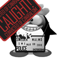
Riz, you know im not a pro so idk what skills are needed for something like
this.. but

1) i dont like the composition; its like the pics are just smacked on the shirt,
there is no.. how us ay it.. they dont really fit together. neither do the colors.
2) i see a silhouette is all that's left of what used to look like a shirt; i dont
see any shadow lines, and looking at the neck part it looks like the selection
thats been colored wasnt made properly
3) maybe this third one is cause im used to seeing awesome works from you,
but unless you brushed all objects yourself, i even dont really see a difficulty
in this piece oO
4) fourth n last, i personally dont like the txt

dont get me wrong, it looks okay as a whole.. im just used to seeing pieces
of you i really love.. n i just dont love this one :)

edit: im off about all day, so i cant see ur reply till the end :( u know im
not trying to bring you down or whatever. stated up there is just my opinion.

expect some nice car pics tonight btw. off to the IAA Frankfurt 8)

:love:


Top
  
 
 Post subject:
PostPosted: Sun Sep 23, 2007 6:04 am 
Ex-Staff
User avatar
Offline

Joined: Jun 2006
Posts: 1197
Location: Artist's Corner
cin wrote:
but unless you brushed all objects yourself


90-95%.

This piece is intended to simulate the feel of a David Lynch film, which I believe I accomplished thoroughly. On top of that it was a challenge from one of my friends - composition must desegregate urban/natural environments.

I guess I'm getting tired of the same old pen tooled lines and silhouettes.


Just an afterthought - I can pump out 'pretty' pieces that people on this forum will eat up like candy all day long, it's a pretty simple equation.

_________________
Image


Last edited by Rizla on Sun Sep 23, 2007 6:11 am, edited 2 times in total.

Top
 Profile  
 
 Post subject:
PostPosted: Sun Sep 23, 2007 6:07 am 
>.< I edited your post darnitall.

edit: could u also be specific on what's brushed? oO


Top
  
 
 Post subject:
PostPosted: Sun Sep 23, 2007 6:21 am 
Ex-Staff
User avatar
Offline

Joined: Jun 2006
Posts: 1197
Location: Artist's Corner
cin wrote:
edit: could u also be specific on what's brushed? oO


Everything but the mans face, and the type on the sleeve/open sign. And it's not all 'brushed' some of the assets I created in 3dsmax.

_________________
Image


Top
 Profile  
 
 Post subject:
PostPosted: Sun Sep 23, 2007 8:41 am 
Banned User
Offline

Joined: Jun 2006
Posts: 4200
Location:
Artist Corner
The lanternpost didn't make it. :P

Anyway, the only think I really don't like is that the colour-change used for the shirt looks like 'a selection made, filled and lowered opacity'. You've lost the 'texture' of the shirt, which could've been avoided by setting the layer to multiply(Even though that doesn't work with the darker colours, I'm sure you know of more ways)

That said I do have to say I love it, the compo is great(even though a bit hectic), and id looks just amazing(to me xD) :)

_________________
<<banned from SRF for proof of botting. -SG>>


Top
 Profile  
 
 Post subject:
PostPosted: Sun Sep 23, 2007 3:17 pm 
Elite Member
User avatar
Offline

Joined: Jun 2006
Posts: 5185
Location: Artists Corner
I love the idea but somethings not right...

I cant put my finger on it.

_________________
Image
Image


Top
 Profile  
 
 Post subject:
PostPosted: Sun Sep 23, 2007 3:26 pm 
Banned User
Offline

Joined: Sep 2006
Posts: 3895
Location: Artists Corner & Aege
great artwork but it doesn't have a real t-shirt feel to it, looks abit unrealistic maby?

i dunno :)

_________________
<<banned from SRF for proof of botting. -SG>>


Top
 Profile  
 
 Post subject:
PostPosted: Sun Sep 23, 2007 9:35 pm 
Addicted Member
User avatar
Offline

Joined: May 2007
Posts: 2629
Location:
Off Topic
It looks really nice, but it doesnt seem like a t-shirt to me

_________________
XemnasXD wrote:
also im not going to stop calling him a cosmic douche, anyone that knows everything about everything, then creates you knowing full you won't end up following the rules he's made up for you, then punishes you for all eternity for it....come on...thats just being a d*ck.


Top
 Profile  
 
 Post subject:
PostPosted: Sun Sep 23, 2007 9:49 pm 
Ex-Staff
User avatar
Offline

Joined: Jun 2006
Posts: 1197
Location: Artist's Corner
0l3n wrote:
I love the idea but somethings not right...

I cant put my finger on it.


I can :) Trust me I'm aware of most of the issues in the piece, just didn't have the time to fix them. The main issue is shadows, most assets don't have any.

_________________
Image


Top
 Profile  
 
 Post subject:
PostPosted: Sun Sep 23, 2007 11:06 pm 
Veteran Member
User avatar
Offline

Joined: Jan 2007
Posts: 3119
Location: Canada,On
I actually like it alot its sumthing i would purchase and my tast in clothing is more urban/hip hop so i already have a few shirts that resemble this the only issue I'm having are the sleeves the art work is overflowing and onto them making the sleeves kinda look like there not there


Top
 Profile  
 
Display posts from previous:  Sort by  
Post new topic Reply to topic  [ 11 posts ] 

All times are UTC


Who is online

Users browsing this forum: Google [Bot] and 24 guests


You cannot post new topics in this forum
You cannot reply to topics in this forum
You cannot edit your posts in this forum
You cannot delete your posts in this forum
You cannot post attachments in this forum

Search for:
Jump to:  
Powered by phpBB © 2000, 2002, 2005, 2007 phpBB Group