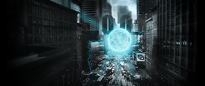
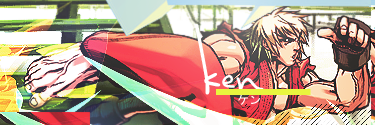
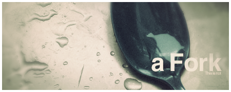
I like the first one better than the second, mainly because of your choice of color I think (personal preference). The text is also wonderful in the first. I think the blur on the bottom left could be blended in a little better.
...and is that a dinosaur rawring on the first one? I can't tell because it is so light. It intrigues me!
These are definitely some very playful graphics and I would encourage you building upon them. They look nice and are fun.

Side note/Personal thought:
Overall I think the blur tool is an overused one with people in this forum section. It can make some nice effects, but I also feel that there is so much more PS can offer. I think that when you use a tool like blur, your main focus should be to make it not look like you used the tool at all. You want your blur to flow naturally and not just happen from nowhere. I'm not saying that is what we have here, but I think you get my point. Having nothing going on in a certain area isn't necessarily a bad thing. Negative space is just as important as the positive, case in point, RuYi's latest submission to the sig wars. I'm not directing this all to you, Rek, I just happened to have all these thoughts come into my head while typing a response to your graphics.
Please don't hurt me!


