|
|
Silkroad Online
|
|
|
Silkroad Forums
|
|
|
Affiliates
|


|
|
View unanswered posts | View active topics
  |
Page 1 of 1
|
[ 14 posts ] |
|
| Author |
Message |
|
izmeister
|
Post subject: NSR~ Midna (V3 added)  Posted: Posted: Sun Mar 08, 2009 4:24 pm |
|
| Frequent Member |
 |
 |
Joined: Feb 2008
Posts: 1138
Location: Yes
|
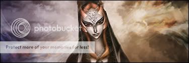
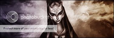
Similar to my soren tag I think.  V2  V3  C&C please.
_________________
You are now manually breathing.
Last edited by izmeister on Sun Mar 22, 2009 6:47 pm, edited 7 times in total.
|
|
| Top |
|
 |
|
Melez
|
Post subject: Re: NSR~ Midna  Posted: Posted: Sun Mar 08, 2009 4:52 pm |
|
| Veteran Member |
 |
 |
Joined: Jul 2008
Posts: 3009
Location: лол шта
|
|
A bit similar, but better imo. The colors are a bit dull.. And when choosing a render, try to choose some that has some natural flow, and/or depth, easier to work with, and it looks nicer.
_________________

|
|
| Top |
|
 |
|
izmeister
|
Post subject: Re: NSR~ Midna  Posted: Posted: Sun Mar 08, 2009 5:28 pm |
|
| Frequent Member |
 |
 |
Joined: Feb 2008
Posts: 1138
Location: Yes
|
Melez wrote: A bit similar, but better imo. The colors are a bit dull.. And when choosing a render, try to choose some that has some natural flow, and/or depth, easier to work with, and it looks nicer. My original plan was to make it black and white which is why the colors came out so dull, but I changed my idea mid-way. Added V2 b&w. And the render, well changing that would change the whole tag would it not? :/
_________________
You are now manually breathing.
|
|
| Top |
|
 |
|
Priam
|
Post subject: Re: NSR~ Midna  Posted: Posted: Sun Mar 08, 2009 8:59 pm |
|
| Forum Legend |
 |
 |
Joined: Jul 2006
Posts: 7885
Location: At the apple store, Cause i'm an iAddict.
|
Melez wrote: A bit similar, but better imo. The colors are a bit dull.. And when choosing a render, try to choose some that has some natural flow, and/or depth, easier to work with, and it looks nicer. Your building a tag AROUND the render. Whether or not it flows naturally, or has super built in depth doesn't matter. It's why we have this thing called creativity, YOU are defining surroundings.
_________________
|
|
| Top |
|
 |
|
Melez
|
Post subject: Re: NSR~ Midna  Posted: Posted: Sun Mar 08, 2009 9:09 pm |
|
| Veteran Member |
 |
 |
Joined: Jul 2008
Posts: 3009
Location: лол шта
|
|
Sorry, you're probably right. Just meant it is easier to work with.
_________________

|
|
| Top |
|
 |
|
DumboDii
|
Post subject: Re: NSR~ Midna  Posted: Posted: Sun Mar 08, 2009 9:20 pm |
|
| Addicted Member |
 |
 |
Joined: Sep 2008
Posts: 2961
Location: Finland
|
|
Ya that render pops out too much. It's like slammed on top of the bg.
_________________
Drop the beat
|
|
| Top |
|
 |
|
Hostage
|
Post subject: Re: NSR~ Midna  Posted: Posted: Sun Mar 08, 2009 9:34 pm |
|
| Veteran Member |
 |
 |
Joined: Jan 2007
Posts: 3119
Location: Canada,On
|
|
Amazing how quick people soil themselves. lol.
Now for the sig. You have a centered focal which is a big no-no, not only because I say so, it's just a rule of fine arts. Use the rule of thirds when you're trying to choose a focal--don know what that is? Google it. Should be easy enough to find. Now it's great you're using complimentary colours however just basing your whole sig on two colours and expect it will give your piece life is naive. Just like everything else even complimentary colours need supportive colours so learn to mix things up using your own artistic eye rather then trying to stay "matchy matchy" and make everything as if it were equal. Some parts deserve more attention then others thus get more colours, shapes, thought put into it then other areas; although this isn't an excuse to lack in the rest of the piece its just to create better focals and flow it needs to be done.
|
|
| Top |
|
 |
|
.Banshee
|
Post subject: Re: NSR~ Midna  Posted: Posted: Sun Mar 08, 2009 9:49 pm |
|
| Valued Member |
 |
 |
Joined: Jan 2009
Posts: 434
Location: Artists Corner
|
Priam wrote: Melez wrote: A bit similar, but better imo. The colors are a bit dull.. And when choosing a render, try to choose some that has some natural flow, and/or depth, easier to work with, and it looks nicer. Your building a tag AROUND the render. Whether or not it flows naturally, or has super built in depth doesn't matter. It's why we have this thing called creativity, YOU are defining surroundings. That is so quotable in my opinion. I just love it. OT: something I do to make my focal blend in the background perfectly is filter>blur>Gaussian blur then set it to screen and lower opacity. Plus it gives your tag a nice little sparkly shine, gives it a bit of depth, and makes it easier to locate the lighting source. And do what hostage said. Just because they SEEM to match doesn't make em look good. Use colors that are included in the focal as well as colors that compliment those primary colors. Otherwise it's dull.
_________________
|
|
| Top |
|
 |
|
izmeister
|
Post subject: Re: NSR~ Midna  Posted: Posted: Mon Mar 09, 2009 8:56 pm |
|
| Frequent Member |
 |
 |
Joined: Feb 2008
Posts: 1138
Location: Yes
|
|
I'll take what you all said into consideration, expect a v3(:O) soon.
_________________
You are now manually breathing.
|
|
| Top |
|
 |
|
0l3n
|
Post subject: Re: NSR~ Midna  Posted: Posted: Mon Mar 09, 2009 10:32 pm |
|
| Elite Member |
 |
 |
Joined: Jun 2006
Posts: 5185
Location: Artists Corner
|
Hostage wrote: Amazing how quick people soil themselves. lol.
Now for the sig. You have a centered focal which is a big no-no, not only because I say so, it's just a rule of fine arts. Use the rule of thirds when you're trying to choose a focal--don know what that is? Google it. Should be easy enough to find. Now it's great you're using complimentary colours however just basing your whole sig on two colours and expect it will give your piece life is naive. Just like everything else even complimentary colours need supportive colours so learn to mix things up using your own artistic eye rather then trying to stay "matchy matchy" and make everything as if it were equal. Some parts deserve more attention then others thus get more colours, shapes, thought put into it then other areas; although this isn't an excuse to lack in the rest of the piece its just to create better focals and flow it needs to be done. Great advice here so take it to heart. Thing that bothers me the most is that its so bland and theres hardly anything going on to make it more alive if you know what I mean.
_________________
|
|
| Top |
|
 |
|
izmeister
|
Post subject: Re: NSR~ Midna  Posted: Posted: Sun Mar 22, 2009 4:37 pm |
|
| Frequent Member |
 |
 |
Joined: Feb 2008
Posts: 1138
Location: Yes
|
|
V3 is up
I tried to use a lot of the suggestions you all gave me.
_________________
You are now manually breathing.
|
|
| Top |
|
 |
|
izmeister
|
Post subject: Re: NSR~ Midna (V3 added)  Posted: Posted: Tue Mar 24, 2009 8:53 pm |
|
| Frequent Member |
 |
 |
Joined: Feb 2008
Posts: 1138
Location: Yes
|
|
bump
_________________
You are now manually breathing.
|
|
| Top |
|
 |
|
Tasdik
|
Post subject: Re: NSR~ Midna (V3 added)  Posted: Posted: Tue Mar 24, 2009 9:58 pm |
|
| Forum God |
 |
 |
Joined: Jan 2007
Posts: 13206
Location: Life
|
|
V3 is much better then the other ones. The colors are a lot more vibrant.
7/10
|
|
| Top |
|
 |
|
lavapockets
|
Post subject: Re: NSR~ Midna (V3 added)  Posted: Posted: Tue Mar 24, 2009 11:23 pm |
|
| Frequent Member |
 |
 |
Joined: May 2007
Posts: 1126
Location: right behind you
|
izmeister wrote: bump From personal experience, it's best to start over and make a new tag. Take what you've hopefully learned from this one, and move on. I suggest you go haunt the tutorial sticky on the site (if you're not going to go out and find ones by yourself) and keep plugging along. You need to work on render blending  GL
_________________


|
|
| Top |
|
 |
  |
Page 1 of 1
|
[ 14 posts ] |
|
Who is online |
Users browsing this forum: No registered users and 5 guests |
|
You cannot post new topics in this forum
You cannot reply to topics in this forum
You cannot edit your posts in this forum
You cannot delete your posts in this forum
You cannot post attachments in this forum
|
|


