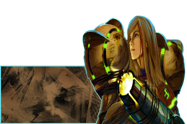
For a first Sig, it looks nice.
There are, however, two things that struck me as soon as I saw it.
1. The bright blue border. It doesn't match with the rest of the colors of the Sig. In my opinion, black would have been a much better border color. Also, the border around the render is extremely uneven and pixelated.
2. The render is squashed. When resizing, you can avoid changing the render’s proportions by pressing Control-T to transform, and then holding
shift while resizing.
Other than that, it’s a lovely Sig for your first try; and as a first Sig, it gets a 7/10 from me. There are quite a few tuts you could follow on SRF in the Sticky, and you can find more than you could even dream about on sites scattered around the Internet.
As far as what font you should use, try
http://www.dafont.com. They have some excellent fonts there for your use, that you can download for free.