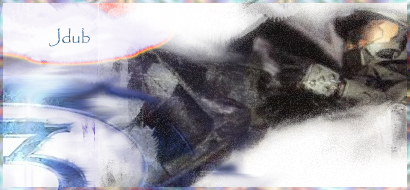
its not bad, however
- no focal point, or too blurry focal point.
because of the amount of white here and the fact that the render is not that
sharp, the eyes dont focus on the render.
- no light source
best would be if you had less white, and make it so that the light (white) comes
from one direction and shines on your rendered figure. this is a great way to
make the sig look more 3D-like.
- text
the text, its good that its not close to the borders, but i personally favor a text
that kindof fits into the sig rather than stands out. if you would not have put it
on the white part of the sig, try to change the layer mode to overlay/soft light
and move it around over the sig. play a bit with it, and i'm sure you will find
a nice spot where the text will blend in but is still readable
- overall look
the overall look is imo a bit over contrasted. too much white and a too dark
render for it. also, the colors of the background dont really go with the
colors of the render you used.
^ not meant as a rant <3 just being honest

its not bad at all for a 2nd sig, but i suggest you try out some tutorials in
the sticky. fena and SuicideGrl tried the BrokenSaint's tut not too long ago,
and both their sigs turned out awesome.