|
|
Silkroad Online
|
|
|
Silkroad Forums
|
|
|
Affiliates
|


|
|
View unanswered posts | View active topics
  |
Page 1 of 1
|
[ 10 posts ] |
|
| Author |
Message |
|
TwelveEleven
|
Post subject: NSR ~ I can't stand the rain  Posted: Posted: Fri Jan 18, 2008 9:48 pm |
|
| Banned User |
 |
Joined: Mar 2007
Posts: 3806
Location: Heaven
|
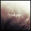
on my window bringing back sweet memories.. That's where I got my inspiration from, sig turned out a bit differently though. Not as good as I hoped, but thought it was worth some positive constructive feedback (or negative, as long as I can do something with it  ) 
_________________
<<banned from SRF for proof of botting. -SG>>
|
|
| Top |
|
 |
|
Swindler
|
Post subject: Re: NSR ~ I can't stand the rain Posted: Fri Jan 18, 2008 9:59 pm |
|
| Forum God |
 |
|
Joined: Apr 2007
Posts: 11256
Location: Pimpas Paradise.
|
i like that sig alot, it makes you want summer  but that i not like is the sig size :/ i think it is to high
|
|
| Top |
|
|
|
Millenium
|
Post subject: Re: NSR ~ I can't stand the rain Posted: Fri Jan 18, 2008 10:00 pm |
|
| Ex-Staff |
 |
|
Joined: Oct 2006
Posts: 2732
Location: Waterloo
|
|
Ohh we have tons of lovely sigs today!
1. Text
I think you can do such a better job. I'm not sure why you chose Italic font, I'm generally not too fond of it, nor in your case it makes the sig any better. When I have a sentence I usually make one word bigger or slightly in different font so I can put some emphasis on it. If I were you I'd write "I can't stand the" in small round letters and "Rain" in a bigger, stylish font.
2. Lighting
I'm not even good at it myself, but I love what you did. Especially around his back. It really shows he's happy the rain has stopped. I'm not sure if I like how you extended the white part all the way to the top though, I'd much prefer to see some clouds and some softer light as (more of a) extension from the light source from middle-bottom.
3.
I kind of like the beam of light thing he's holding. Though the thing at bottom right bothers me. Its kind of bright. I'd prefer it if it wasn't there.
_________________
DID YOU KNOW? Milly has retired!!!!
Status: Into Minecraft
 
|
|
| Top |
|
|
|
iNunoPT
|
Post subject: Re: NSR ~ I can't stand the rain Posted: Fri Jan 18, 2008 10:03 pm |
|
| Common Member |
 |
|
Joined: Aug 2007
Posts: 154
Location: quit sro long time ago
|
bad, i rly liked the 'pop-out' chick  lol now, serious - i think its ok but the text could be more readable? though i need glasses, i cant read it all other than that i like it  (off topic:)  nice someone (milly) posted while i was writing and the php suggest me to review my post rly c00l!!
|
|
| Top |
|
|
|
christina
|
Post subject: Re: NSR ~ I can't stand the rain Posted: Fri Jan 18, 2008 10:24 pm |
|
| Banned User |
 |
|
Joined: Oct 2007
Posts: 1017
Location:

|
|
I LOVE IT 9.5/10
Only thing is,
I cant see the text.
_________________
<<Left because of dumbshit people like stallowned>>
|
|
| Top |
|
|
|
TwelveEleven
|
Post subject: Re: NSR ~ I can't stand the rain Posted: Fri Jan 18, 2008 10:28 pm |
|
| Banned User |
|
Joined: Mar 2007
Posts: 3806
Location: Heaven
|
Millenium wrote: Ohh we have tons of lovely sigs today!
1. Text
I think you can do such a better job. I'm not sure why you chose Italic font, I'm generally not too fond of it, nor in your case it makes the sig any better. When I have a sentence I usually make one word bigger or slightly in different font so I can put some emphasis on it. If I were you I'd write "I can't stand the" in small round letters and "Rain" in a bigger, stylish font.
2. Lighting
I'm not even good at it myself, but I love what you did. Especially around his back. It really shows he's happy the rain has stopped. I'm not sure if I like how you extended the white part all the way to the top though, I'd much prefer to see some clouds and some softer light as (more of a) extension from the light source from middle-bottom.
3.
I kind of like the beam of light thing he's holding. Though the thing at bottom right bothers me. Its kind of bright. I'd prefer it if it wasn't there. 1.It's not an italic font, I skewed it italic, because I thought that would look better. 2.The reason the light is coming all the way from the top is because there's a strange line going over the clouds that messes up the stock 3. fixed  @ Christina come on msn and help me with the text please. You seem to be good with it (Mine is twelveeleven1211@gmail.com)
_________________
<<banned from SRF for proof of botting. -SG>>
|
|
| Top |
|
|
|
Faiien
|
Post subject: Re: NSR ~ I can't stand the rain Posted: Fri Jan 18, 2008 10:35 pm |
|
| Active Member |
 |
|
Joined: Oct 2007
Posts: 889
Location:
|
|
i like the new edited version
i think you should tone down the lights a little and fix the right side of the sig where one of his figers is below the light while the other two are above? who knows you might have done that on purpose
but i dont really like the text location wise
flow and depth are both good to go
|
|
| Top |
|
|
|
TwelveEleven
|
Post subject: Re: NSR ~ I can't stand the rain Posted: Fri Jan 18, 2008 10:37 pm |
|
| Banned User |
|
Joined: Mar 2007
Posts: 3806
Location: Heaven
|
Faiien wrote: i like the new edited version
i think you should tone down the lights a little and fix the right side of the sig where one of his figers is below the light while the other two are above? who knows you might have done that on purpose
but i dont really like the text location wise
flow and depth are both good to go That's to make it look like it's going through his fingers. Text has always been a killer for me, with 1 word it's not so hard, but with a whole sentence.. It really is. Wouldn't know where to place it or what font to use.
_________________
<<banned from SRF for proof of botting. -SG>>
|
|
| Top |
|
|
|
cin
|
Post subject: Posted: Fri Jan 18, 2008 11:09 pm |
|
|
|
|
i like it much.
just a tad too bright for me, but could be my screen ;]
|
|
| Top |
|
|
|
HOLLAstir
|
Post subject: Re: NSR ~ I can't stand the rain Posted: Sat Jan 19, 2008 12:33 am |
|
| Loyal Member |
 |
|
Joined: Aug 2007
Posts: 1637
Location: 206
|
|
Omg my eyes haha, yeah it's a bit too bright bro. I do like the concept of the sig though.
Even though it's already been said, your text is killing your focal. I would stick with somethin simple, like an Arial or any type of Sans Serif font. Maybe grab a light blue color from your sky, or a meduim shade of gray. I'd experiement with those two color schemes.
Personally i'd take one word and elaborate on it, make it stand out and flow. Like elaborating on "stand."
To the top-left of his hand in the right corner there's something above the cloud, but It looks really out of place. Looks really unnatural. Then you have what appears to be a pen tool line going throug his hand. Personally I'm not really feeling it being there. I don't have much of a suggestion for it, so I hate to criticize (in a sense) it without giving a suggestion. Maybe having the pen tool wrapping around his arms? Like it's traveling up his arms? Not too sure myself, sorry.
All in all I like it. I really liked the idea, just a little bright and a few things here and there that need tweaking, mainly text. Regardless, still a good job with it and it definately reminds me of those warm sunny summer days. Good job <3
_________________


|
|
| Top |
|
|
|
|
Page 1 of 1
|
[ 10 posts ] |
|
Who is online |
Users browsing this forum: No registered users and 2 guests |
|
You cannot post new topics in this forum
You cannot reply to topics in this forum
You cannot edit your posts in this forum
You cannot delete your posts in this forum
You cannot post attachments in this forum
|
|

