|
|
Silkroad Online
|
|
|
Silkroad Forums
|
|
|
Affiliates
|


|
|
View unanswered posts | View active topics
  |
Page 1 of 1
|
[ 21 posts ] |
|
| Author |
Message |
|
Key-J
|
Post subject: Hows my sigz?  Posted: Posted: Tue Nov 14, 2006 1:37 am |
|
| Retired Admin |
 |
 |
Joined: Jun 2006
Posts: 8238
Location: twitch.tv/AFKidsGaming
|
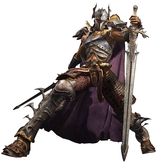
So i tried my hand at making a sig for my friend...
Rate and suggest.. BTW this is my second SIG ive made 
2 Versions
1:

2:

Be nice..
_________________
|
|
| Top |
|
 |
|
Key-J
|
Post subject: Posted: Tue Nov 14, 2006 2:05 am |
|
| Retired Admin |
|
|
Joined: Jun 2006
Posts: 8238
Location: twitch.tv/AFKidsGaming
|
|
Aightz.. Well the size doesnt matter cuz its not for this forums.. O and whcih one do u like better?
_________________
|
|
| Top |
|
|
|
LittleTom
|
Post subject: Posted: Tue Nov 14, 2006 2:20 am |
|
| Active Member |
|
Joined: Nov 2006
Posts: 638
Location: Life
|
|
Ya the second one is better.
_________________

|
|
| Top |
|
|
|
Key-J
|
Post subject: Posted: Tue Nov 14, 2006 3:31 am |
|
| Retired Admin |
|
|
Joined: Jun 2006
Posts: 8238
Location: twitch.tv/AFKidsGaming
|
Good cuz my friend chose the 2nd one as well... I wanted to make a border.. but then saved it and forgot.. so i was like.. well wtvr
_________________
|
|
| Top |
|
|
|
Luoma
|
Post subject: Posted: Tue Nov 14, 2006 7:15 am |
|
| Banned User |
|
Joined: Sep 2006
Posts: 3895
Location: Artists Corner & Aege
|
LittleTom wrote: Ya the second one is better.
+1
_________________
<<banned from SRF for proof of botting. -SG>>
|
|
| Top |
|
|
|
satman83
|
Post subject: Posted: Tue Nov 14, 2006 11:48 am |
|
| Site Contributor |
 |
|
Joined: Oct 2006
Posts: 9541
Location: London
|
Key...i have to say the second one to.....also...who is Faros
have you been cheating on SRO..... 
_________________
|
|
| Top |
|
|
|
nansif2
|
Post subject: Posted: Tue Nov 14, 2006 12:43 pm |
|
| Casual Member |
 |
|
Joined: Sep 2006
Posts: 93
Location:

|
|
the 2nd one is very nice!!
where did u got this render????
_________________

|
|
| Top |
|
|
|
Key-J
|
Post subject: Posted: Tue Nov 14, 2006 3:43 pm |
|
| Retired Admin |
|
|
Joined: Jun 2006
Posts: 8238
Location: twitch.tv/AFKidsGaming
|
Glad you like it guys.. He gave me the render... If u want ill host it and yall are free to use it
_________________
|
|
| Top |
|
|
|
nansif2
|
Post subject: Posted: Tue Nov 14, 2006 3:47 pm |
|
| Casual Member |
|
|
Joined: Sep 2006
Posts: 93
Location:
|
Key-J wrote: Glad you like it guys.. He gave me the render... If u want ill host it and yall are free to use it pls do it!!! really nice render!!
_________________
|
|
| Top |
|
|
|
hitokiri
|
Post subject: Posted: Tue Nov 14, 2006 4:25 pm |
|
| Veteran Member |
 |
|
Joined: Feb 2006
Posts: 3503
Location: here
|
|
| Top |
|
|
|
Key-J
|
Post subject: Posted: Tue Nov 14, 2006 4:40 pm |
|
| Retired Admin |
|
|
Joined: Jun 2006
Posts: 8238
Location: twitch.tv/AFKidsGaming
|
|
| Top |
|
|
|
Key-J
|
Post subject: Posted: Tue Nov 14, 2006 5:09 pm |
|
| Retired Admin |
|
|
Joined: Jun 2006
Posts: 8238
Location: twitch.tv/AFKidsGaming
|
|
Wahahahahahaah
_________________
|
|
| Top |
|
|
|
0l3n
|
Post subject: Posted: Tue Nov 14, 2006 6:42 pm |
|
| Elite Member |
 |
|
Joined: Jun 2006
Posts: 5185
Location: Artists Corner
|
|
its a c4d in the backround right?
p.s. the second one is better
_________________
|
|
| Top |
|
|
|
Caras
|
Post subject: Posted: Wed Nov 15, 2006 8:05 am |
|
| Frequent Member |
 |
|
Joined: Sep 2006
Posts: 1337
Location: Place to place.
|
|
Looks like all you did was put a few c4ds in there, added a glass-textured text and slaped a render on. 5/10
|
|
| Top |
|
|
|
oktaytheazer
|
Post subject: Re: Hows my sigz? Posted: Fri Dec 01, 2006 10:21 pm |
|
| Frequent Member |
|
Joined: Nov 2006
Posts: 1123
|
Key-J wrote: So i tried my hand at making a sig for my friend... Rate and suggest.. BTW this is my second SIG ive made 2 Versions 1:... 2:... Be nice.. "be nice"  lol
|
|
| Top |
|
|
|
Shimohime
|
Post subject: Posted: Sat Dec 02, 2006 9:24 pm |
|
| Active Member |
 |
|
Joined: Feb 2006
Posts: 788
Location:

|
|
It's a cool sig, but I would suggest changing the colors/add color effects to the background to correlate with the render.
_________________
Lvl 5x- Ice Archer
Read my avatar tutorial here
|
|
| Top |
|
|
|
naljamees51
|
Post subject: Posted: Sun Dec 03, 2006 9:51 am |
|
| Frequent Member |
 |
|
Joined: Mar 2006
Posts: 1054
Location: Estonia
|
|
| Top |
|
|
|
|
Page 1 of 1
|
[ 21 posts ] |
|
Who is online |
Users browsing this forum: Google [Bot] and 11 guests |
|
You cannot post new topics in this forum
You cannot reply to topics in this forum
You cannot edit your posts in this forum
You cannot delete your posts in this forum
You cannot post attachments in this forum
|
|


