It's great step up just a few things and since there's nothing else to do today I took the liberty of using visual aids.
(I'm going to say "you" a lot I'm just talking in general not picking on you, kirk. =})
First off now blurring is a great thing, it can ad depth and also helps blends images in if used right but you need to learn your limits, applies to sharpening aswell. Always learn how to control it. In this case since your smudging is moving in an outwards direction.
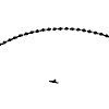
[Birds eye view]

towards your mid ground you don't really need to blur it. Instead make a New Layer> Paint bucket Tool> Fill black set it to overlay lower the opacity and erase where needed. It's going to add depth and fade/blend the smudging more into the background. should look something like this;
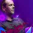
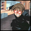
The light source was really overwhelming so I went into "Selective Colour" and dropped down the black and cyan.
Now the next problem I saw is that you were lingering to close to monochrome town and that place sucks. The food is bad, there is a funky smell in the air and old people stare at you wherever you go, stay out of there. Now since you don't have the PSD what you do is make a new layer, set it to colour, choose a flesh toned colour, soft brush on low opacity and lightly brush over where you need. Try to think back to pre-K where you had to colour in the lines.
Do this where you see fit. My end result;
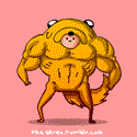
A few gradients and Curves:- Ok, now you there were very cool colours with little none warm colours to compliment them so I used the yellow to blue gradient ( it's standard)> set ti Darken> lower opac.
- To blend these colours in now and to emphasize the colours you've already chosen use a Magenta to Cyan gradient set to Lighten> lower opac.
- Curves>use settings you see fit. Not to dark or light just enough to pick out the shadows and tones.
End result;
Noticed the sig had a lot of noise so to reduce this go into Guassian blur> settings around 0.3 and set the layer to light colour, low opacity.
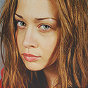
Lightingthe great thing about using a Nero stock/Render is that he already had a natural light source coming from his claw you really didn't need to add one but anyway. Keep in mind to add the light to the render that would come off of the claw, like so:
Smudge and blur this in, set the layer to Linear Dodge and lower the opac. This was my end result I went ahead and added a more defined light source in the palm, that's your choice.
BurningTo further emphasize the lighting take the burn tool with a soft brush, low opac, and brush areas that have a more darker tone. so like areas under the cheek bone, grooves of the eyes, where your neck and jaw meet etc.
Ok, this is where what I was saying about the smudging and blurring thing comes into play. Apply IMG.> Burn Tool> Soft brush low opac> brush along where you know the light won't reach to create shadows/tones thus adding depth. You can also burn in the folds and wrinkles of the cloths. End result:
On a new layer with a soft brush set on low opacity start shading in with black. Remember you have two light sources so most of your shading will be mid ranged. End result:
Since this is a smudge based sig, unless the smudging is out of this word wtfbbqsuace, it will get boring and rather then C4d spamming which is the mark of a novice ( now this is a more personal thing it's not really what everyone does) try thinking of a certain scenario in your head that you would like this sig to portray, almost like telling some sort of story. So I decided this would be something along the lines of a pre atk so I added a few Fx's around the claw/hand. Only reason I'm not going into detail on how I did them is because they're not that hard, this post will get really long and I want you to come up with your own ideas.
LAST MINUTE C4DS are the YUK!!
Don't do that it kills your sig instead try coming up with new effects instead of always relying on c4d spammage, make pentool your friend, yonder into places you have yet to explore in Ps just do something that doesn't result in " apply c4d now, set to such and such setting, f
uck fikkity yay! look at my awesome sig". That being said my final result.

there now it's a collab. Over all the sig was awesome, just needed a bit of concept and compo work. Next time you think you're done step away from the computer go take a poop, grab a drink, come back and take a second look. =} keep up the good work before long you'll be teaching everyone else here.
EDIT: Oh my, that ended up being a hefty ass post. xD


 [/url]