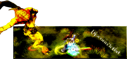
I like this one a lot, done very well.
I would however drop the text, you seem to go overly fancy with your fonts -- not text but font, having a little creativity with text is fine and even encouraged but try not to mix and match a handful of fancy fonts it just looks yucky. Especially not in sigs and while we're at it scrap the "cinema" style border, it's making your sig look thin and since you're already working with a small narrow canvas there's no need for it. Besides, leave borders to bigger works that have a canvas with a need for one. I personally don't see the need for them in sigs anyways especially the cinema style one, put our nooby days behind us shall we? It's 2009 now.

Anyways overall great job I would throw a little more green on your left side, something "foresty" since that's the type of scene I imagine going on behind her. Other then that and a bit more post work I'd say you're fine.


