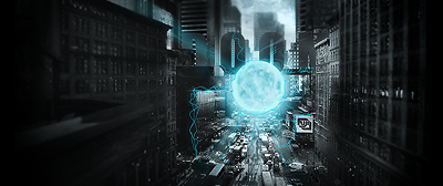
Im sorry to say that I have nothing good to say about this one.
Depth: There is none.
Lighting: Again, none.
Text: Bad, you even put some of the text on the oposite side of the render (riz would not like the edge text

).
Focalpoint: As it is now you have 3 different focal points, one being the render itself and the other 2 the text.
Border: To thick and eye catching, you want people to look at the contents of a painting not its frame.
Flow: Id say this is the best part of the sig but you could work on it some more to make it go less in a straigt line, it makes the flow look forced.
Please dont take this the wrong way, I know you can do way better then this. We all have our up's and down's.


